
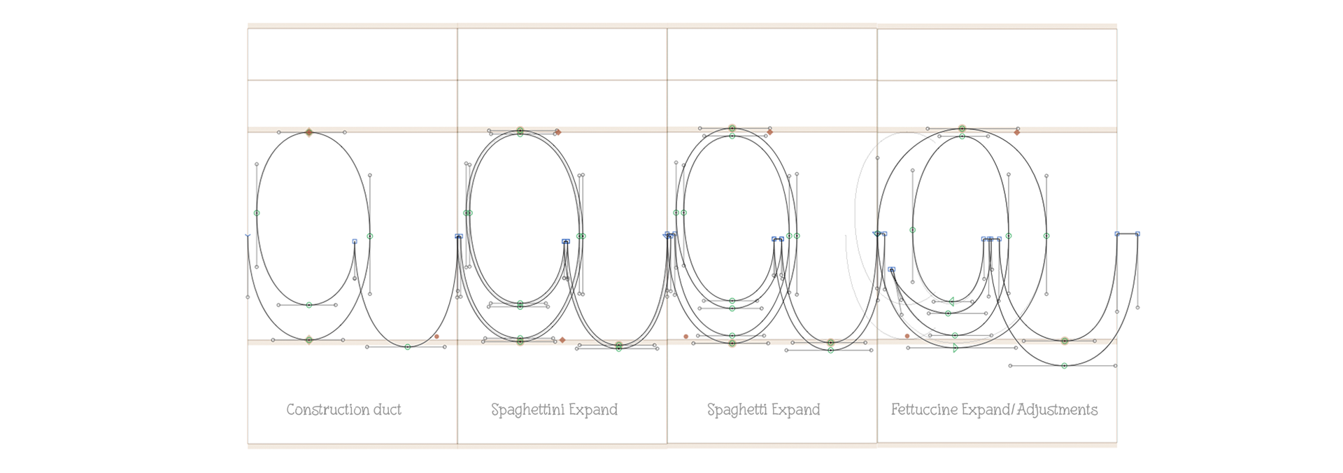
The 3 weights were all based on the same initial construction duct, all vectors directly. I did some handmade sketches, but just to figure out the idea, I did not scanned them
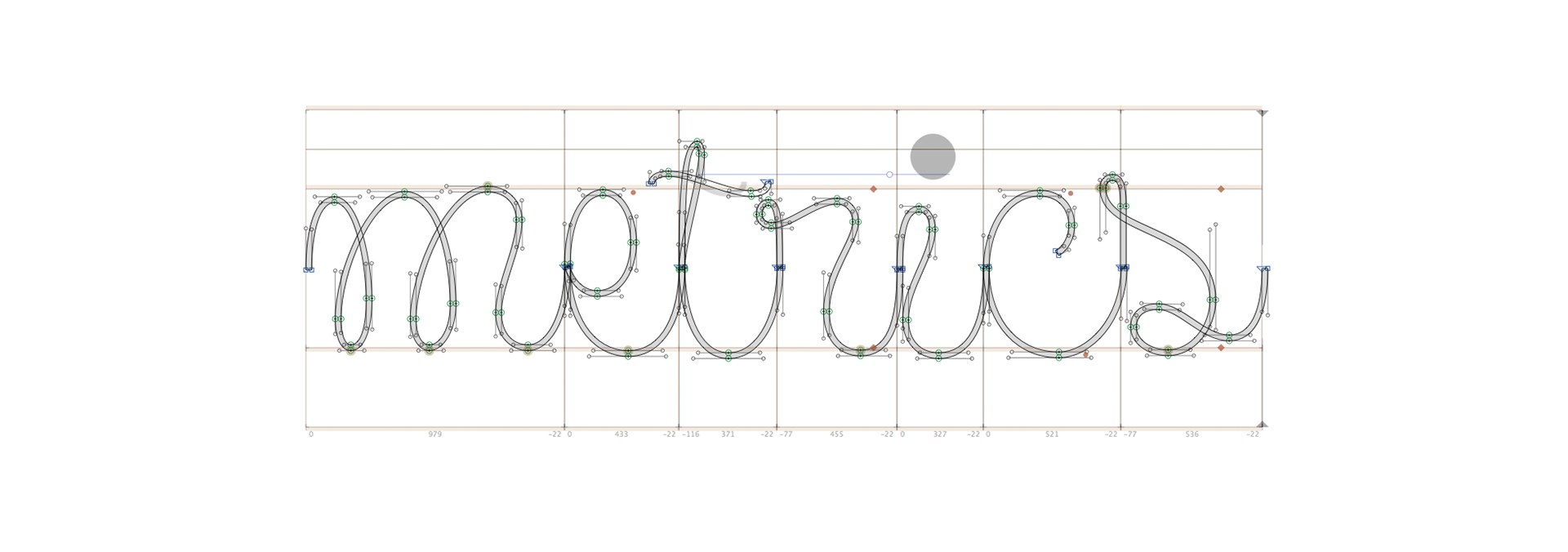
My goal was to achieve a script typeface with as little ligatures as possible. Everything should connect smoothly, no kerning between letters, just well adjusted metrics. In the end, I did some ligatures for curves corrections and a few alternates, but nothing that wasn't necessaire.


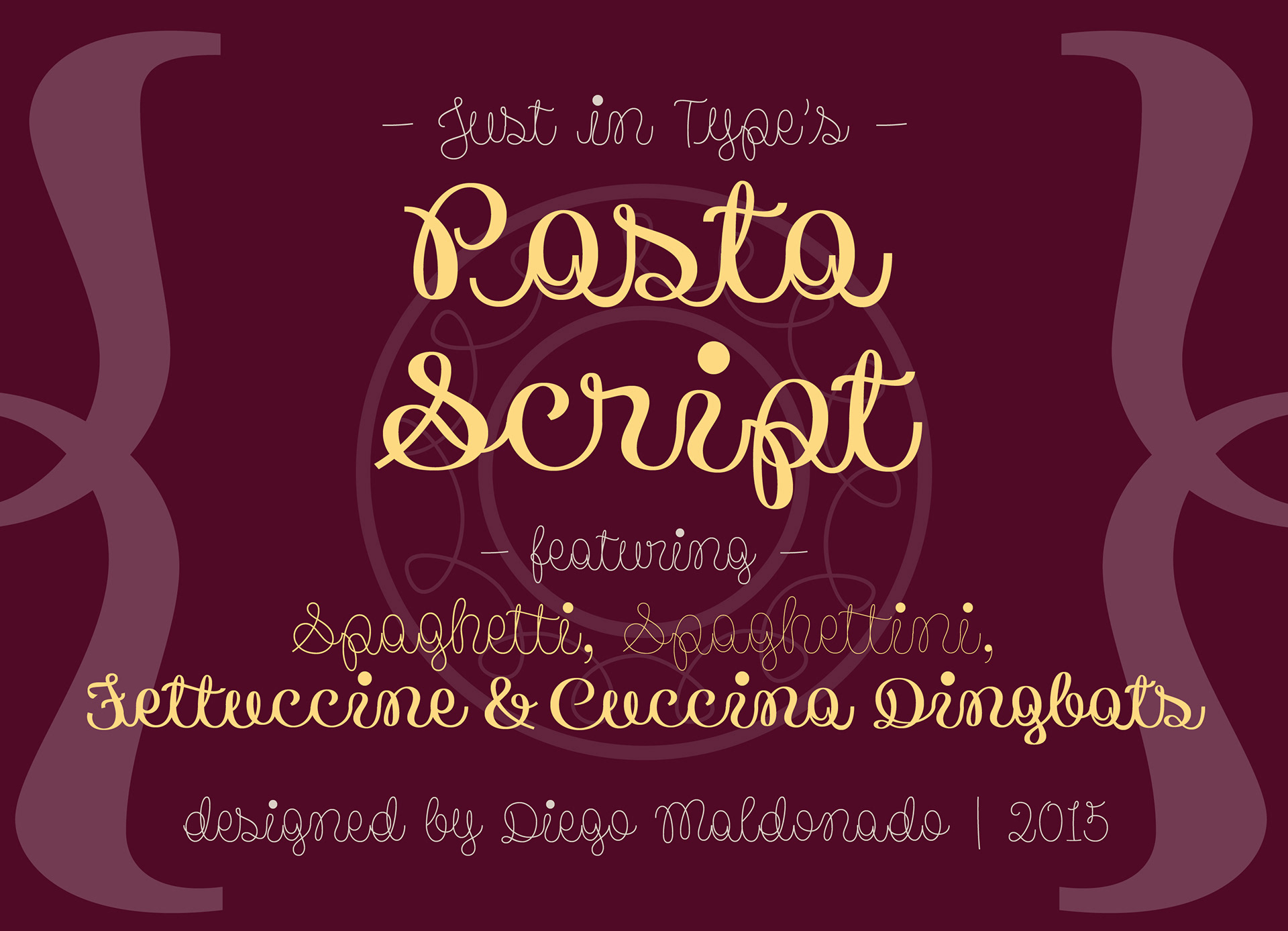
beside the 3 weights, there's a free set of dingbats on MyFonts
buy at MyFonts, Creative Market or Fontspring